Story of building a builder
Rethink a single most important feature of the Futures and Options trading
March 2020
Employer
2.5 Months
White Board, Balsamiq, iPad, Sketch
Design process

First understand basics
So let’s say we want to trade Futures and Options in Reliance. So there will be different strikes and one ATM (At The Money). Which means a current price of reliance is a ATM and rest up and down stepper numbers will be different strikes for Reliance.
So as per today Realince stock price is 1087 so ATM will be 1100 so nearby all other numbers will be strikes like,
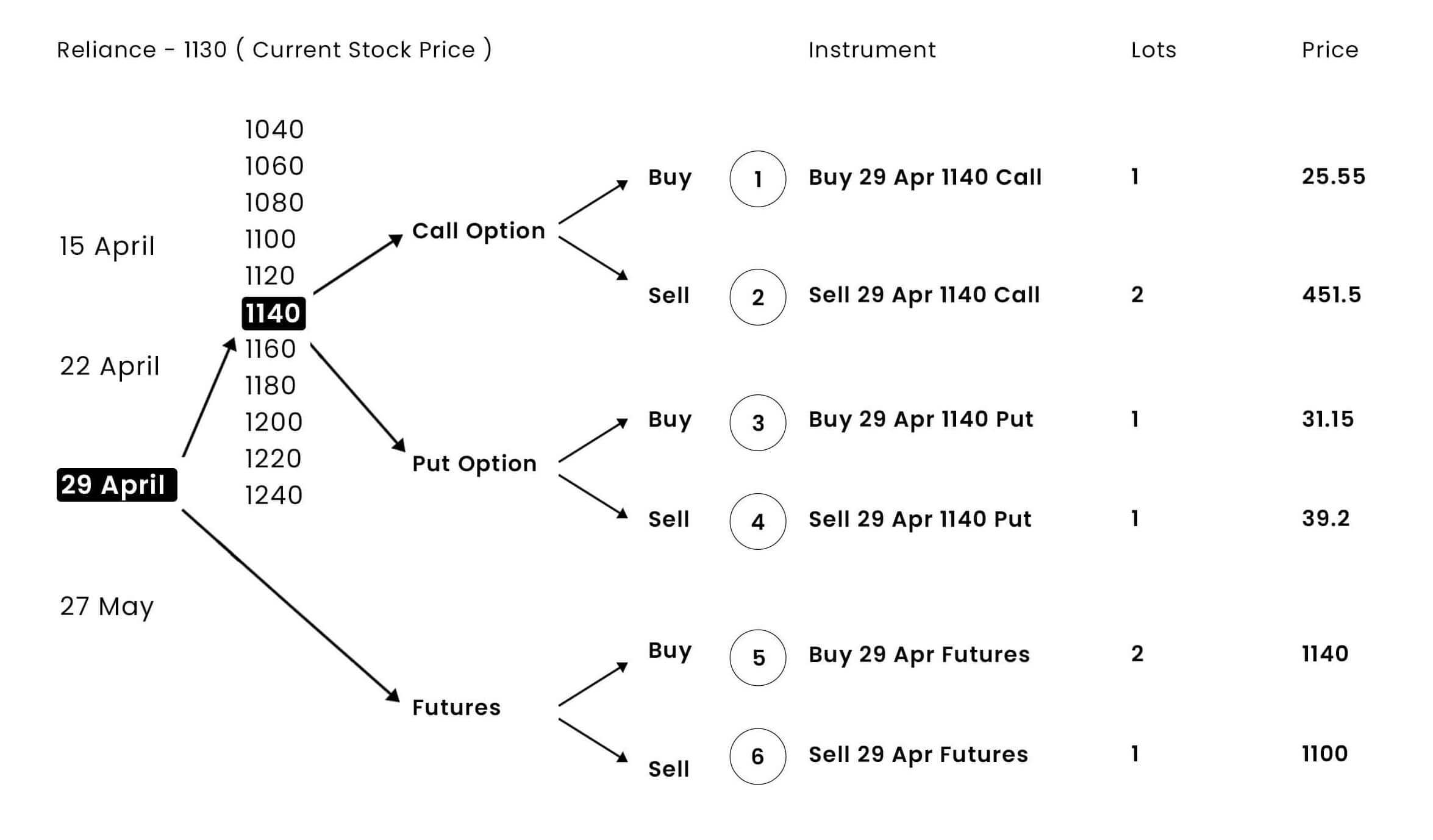
Call – Buy a call option, then you will make money if the price goes up and if you sell then vice versa
Put – Buy a put option, then you will make money if the price goes down and if you sell then vice versa
Expiry – A contract ending date for futures & options.
Lot – A multiply number of stock prices decided by SEBI for a particular stock. And you can only trade numbers of lots together.
And combinations of different options make a strategy. That strategy is what something user wants to analyze first and trade from a builder.
Old version

I believe, a designer’s job is to bridge business and user's need with product experience
Starting with stakeholder interviews
When you have pretty good experienced F&O traders as a stakeholder for Sensibull, you are like at halfway to a user test. A person can suggest good empathy and also business requirements together. This interview helped me a lot to understand the reason behind doing a task from both perspectives.
I am not allowed to share detailed business goals. But can mention some user-centric discussion.
Here below are insights that came from stakeholders interview,
- The builder should be the most intuitive feature
- Clarity while trading comes first
- Mobile experience should be also simplified
Users and pain points
Interacting with real users and their pain
We had interviewed 8 users among them 2 are not a pro user and 6 were pro. Since stakeholders want a new users as well to use builder non-pro users also needed to included in this process.
Pro F&O traders
- Selecting a leg is difficult.
- To change something in existing leg is time consuming and difficult too
- I mostly use my laptop for sensibull and I need to scroll everytime I check graph and important data and change sliders
- Another trader has a wider screen so in that case he need to change leg all the way left and check graph to right. Which is bad
- I have a major focus on graph and the strategy we are building.
- Clarity with data about max profit and max loss is something I focus more before hit the trade button
- Once I hit a trade button even with a changed price in my bucket. I didn’t know the strategy I’m entering has changed the price.
- I have not used builder in mobile. Even for 1 or 2 legs of trade I prefer desktop builder to get clarity and trade.
- Reading data in table is difficult.
Simple Equity Trader
- I came from broker platform and saw option chain and came to builder where there is nothing I can understand
- I don’t understand legs and other terminologies of options trading
- I understand equity the clear things like how much I need to pay, how much I will earn if thing goes according to my expectations and how much I will loose if not went as expected
- If somehow you assure me about the small max losses I would try at least for 1 time
- Futures and options seems very difficult and lots of terms are there so I do not prefer to trade into. There can be the case of losing more money than equity.
- I know in Futures and option I can make money even if market is going down. But it seems non obvious to me to do that.
- I need to learn first and then I will try
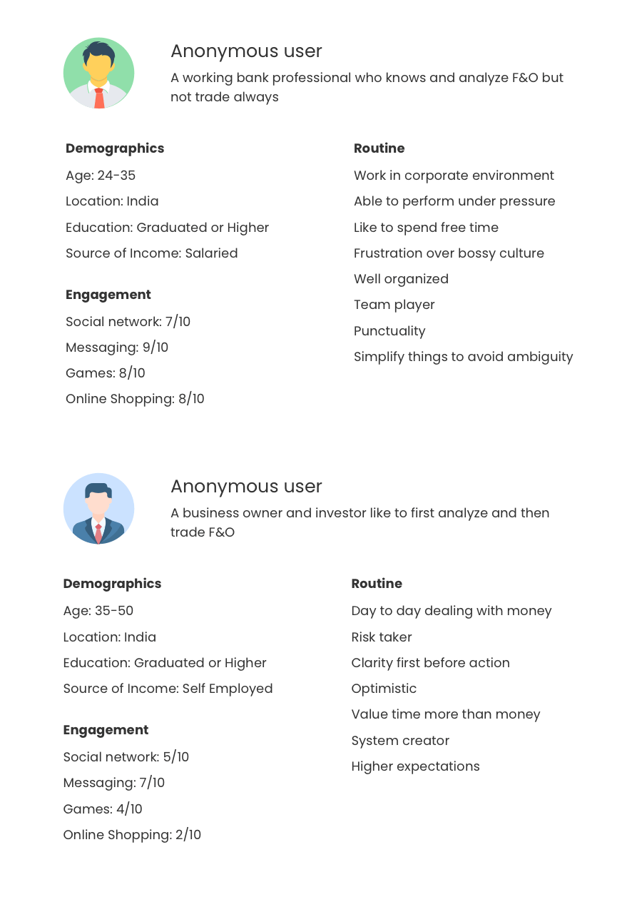
Who is our user?
Below are two user personas that includes most of userbase. So we thought of to take this both groups.
Competitive Analysis

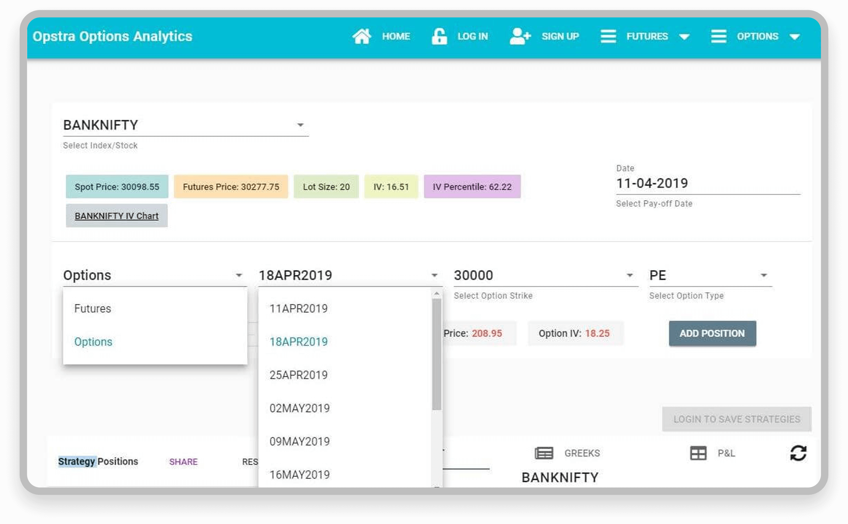
Opstra has a very similar kind of feature and interactions for building F&O strategy. Both have an almost equal number of actions required to do a job for strategy creation and edition. In the user interview, we found out 1 interesting fact that users are happy even if you ask them to edit a single leg in a completely new window and update the strategy. Because of the attention, they have for particular in process action.
Key Insights
- Higher mental burden to consume
- Difficult to interact with complex data
- Graph is the most important part
- Learning curve is big even if to do simple trade
- Clarity in live data
- Mobile is big no for trading strategy
- Afraid of bi-directional trades
- Non pro can be interested to try once if there is more clarity and easy stuff
- All major aspects should be visible in single glance
- Problem in readability
User flow

Two major pain points
- Create & Edit Strategy
- Analysis with different targets
1. Create & Edit Strategy
There are few options to create a strategy,
- User can come from options chain
- User can come from virtual trade where they already have strategies created
- User can manually create a new strategy
We understand that for a new trader it is impossible to first go and learn F&O trading than come to builder and create strategy will be a happy flow. No one does that 😀
Hence, problems only reamined to simplify manually creation of strategy easier. And make something more intuitive and easy to help new trader to do a trade without actually knowing in details.
Ready-made strategies
At the time of reasearch I found out there is F&O strategies with a particular pattern and they also call it by it’s particular name. This insight was amazing but for a new user to understand strategy is already a difficult task then how will they understand predefined strategies?
To solve that problem I came up with a middle solution which is going to help both traders. A group of strategies that system can offer with a graph itself to understand how a strategy is about to perform. This is we thought will be good idea,

We call this idea Ready-made Strategies. You select it and the system will do the rest.
User can see an image which suggests the direction and a name attached to it which helps the user to learn and for a pro trader it is a way better option that makes a strategy out of nothing.
Adding and editing legs in strategy
Users used to interact with the below version,
This interaction is the heart of the whole feature. Pro traders found very difficult to add and edit legs to create their own strategies.
To create a strategy a trader needs to select the below things just to add or edit a single leg,
- Underlying
- Strike
- Expiry
- Call / Put
- Buy / Sell
- Lots
Because of the market time user can not really do multiple clicks just for simple changes or legs addition. So we want users to deal with the whole process of leg addition and editing with as minimum as position action required from them.
I found users not just want to add or edit legs they also want to review while making. It is not possible for that the user creates one leg and goes back and then comes back and does it again. So the interaction has to be reviewable for the user.
To allow user to do that I came up with this solution for addition and editing legs,
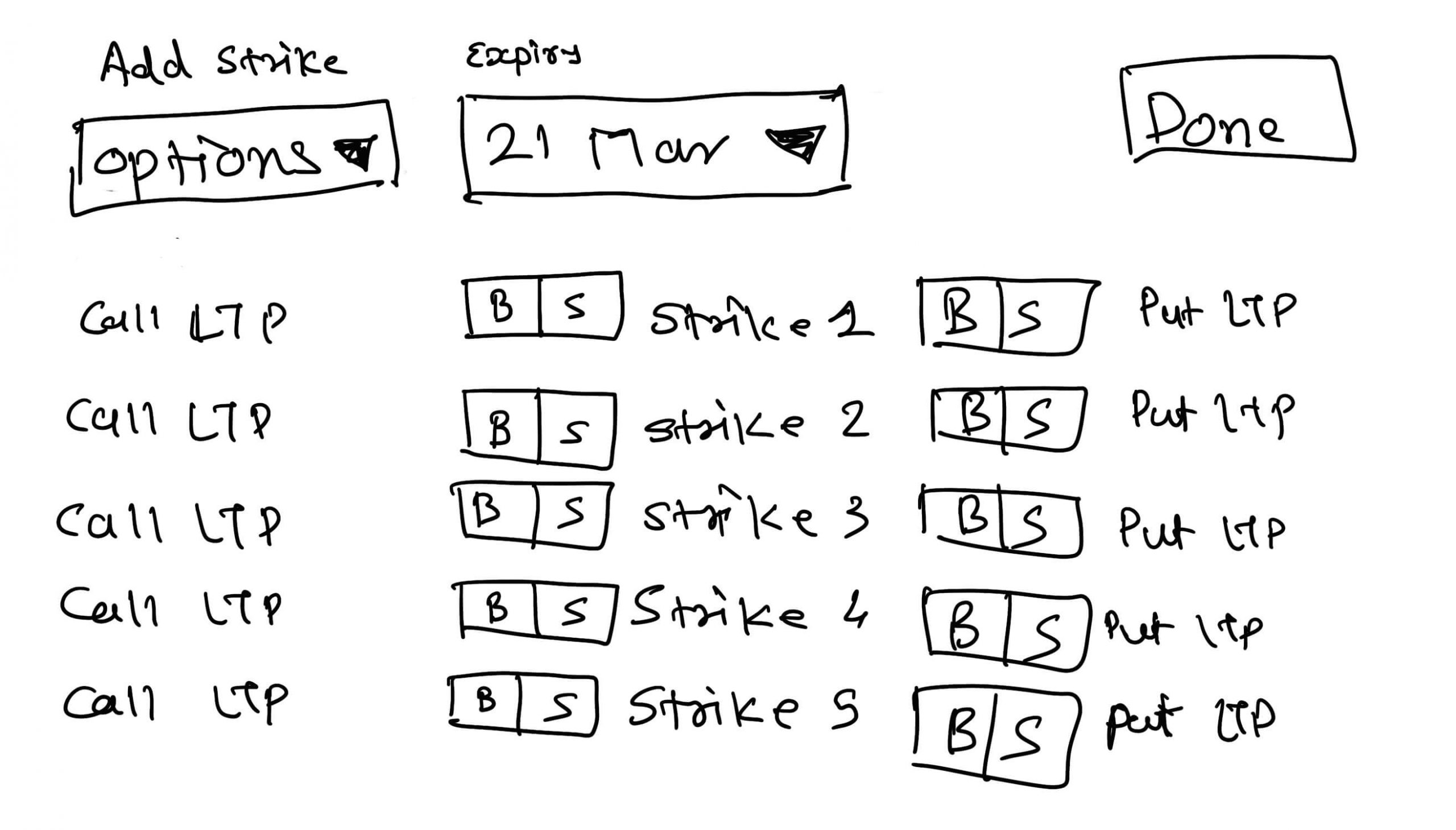
There is already a Buy and sell options with each strike for a call and put. So to adding a new leg user can be done with just 1 click only. This idea was a game-changer for the entire feature.
2. Analysis with different targets
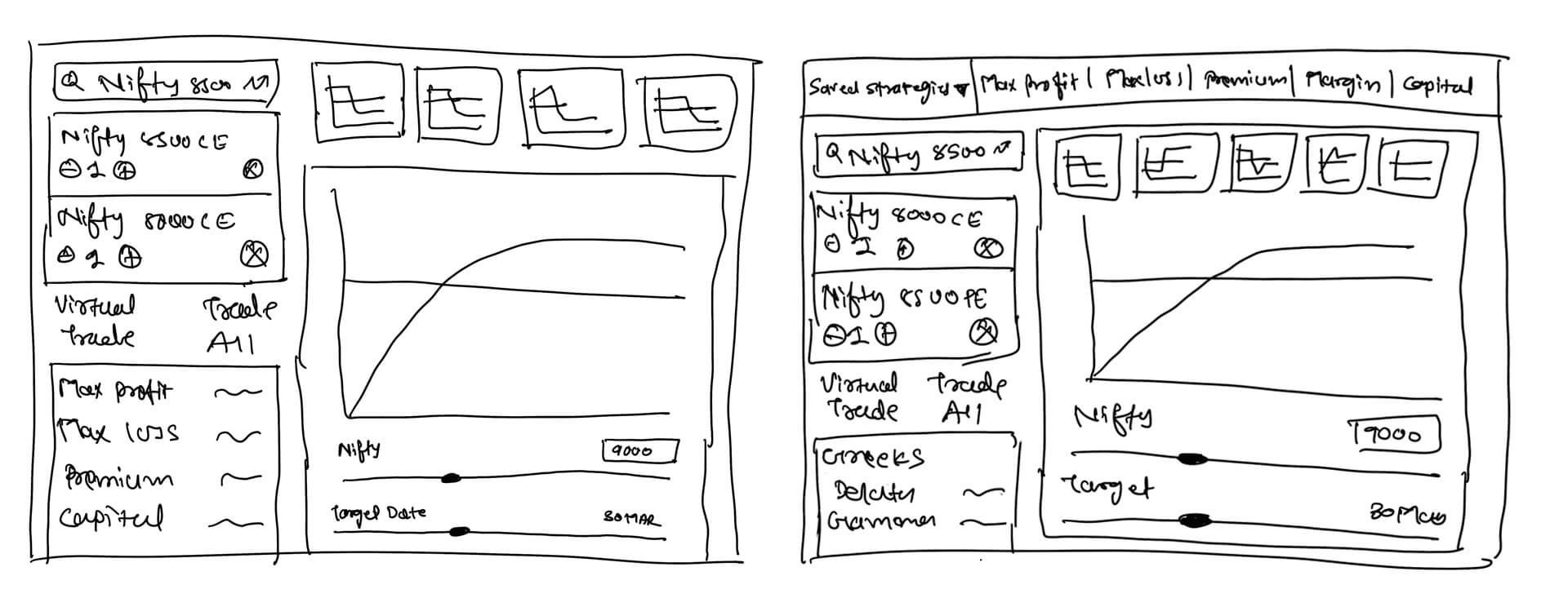
When I take a step back from the whole experience and understand the area of use I found a big amount of space is occupied by the legs in strategy even after you done with creation.
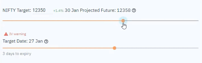
After set up with strategy there is no need to have a bigger space for that area. On the other side after having the strategy ready user quickly wants to analyze that with a target date and strike. So in that flow, they are more interested to see a better and wider graph by moving sliders for different targets.
That’s why I choose ⅓ of area for strategies and summary and ⅔ of area for graphs and sliders.
Here targets don’t have any direct input even if the user precisely wants to add something. That I covered in wireframing layout.
Wireframing layout
In this ideation part, I try to maximize and think about all possible approaches we can have for the problem. Below are few versions of the process.

Interestingly users are used to the current layout of the feature and also in the competitive analysis I found that users feel very easy to create a strategy at left and analyze at right on the desktop.
So that I freeze the layout for the desktop and mobile with stakeholder discussion and moved ahead.
Low-Fi user test
I try to ask stakeholders and some pro users about each separate interaction with low-fi version. It was not a clear prototype also. I tried to do on paper and pen and explained the flow. Below are insights came after that.
- They understand the usage of new leg picker and edit part.
- Editing / Adding & Review can be done on a single small window. That approach save more time and improve accessibility.
- Ready made strategies is a beauty and are understandable also
- Layout has changed in terms of width which enables them with bigger graph space
- Position of summary was difficult to decide. At the top or at the bottom of left column
- Overall layout was intuitive enough for desktop
- User never used mobile experience for trading and analyze strategies. With this layout in mobile also help them to understand information importance
Insights and improvements
Users were happy with the same layout of the current builder. In the user test, the change of summary position was unexpected for the user. They were assumed to have a summary at the same place where it is now. Basically, there is no meaning to break their basic usage behaviour.
So I kept the same layout with a change of column width for both. After freezing all suggestions and solutions finally time to move on to Hi-Fidelity work.
Time to move from low-fi to high-fi.
UI components
I took the approach of having a grey background with white widgets. Which actually helps the user to focus on particular stuff without getting confused by cognition load.
Another thing is there was no standard UI language in this feature that should be in focus in different processes for a user. Users were just struggling in the flattered visual to find relatable actions and information.
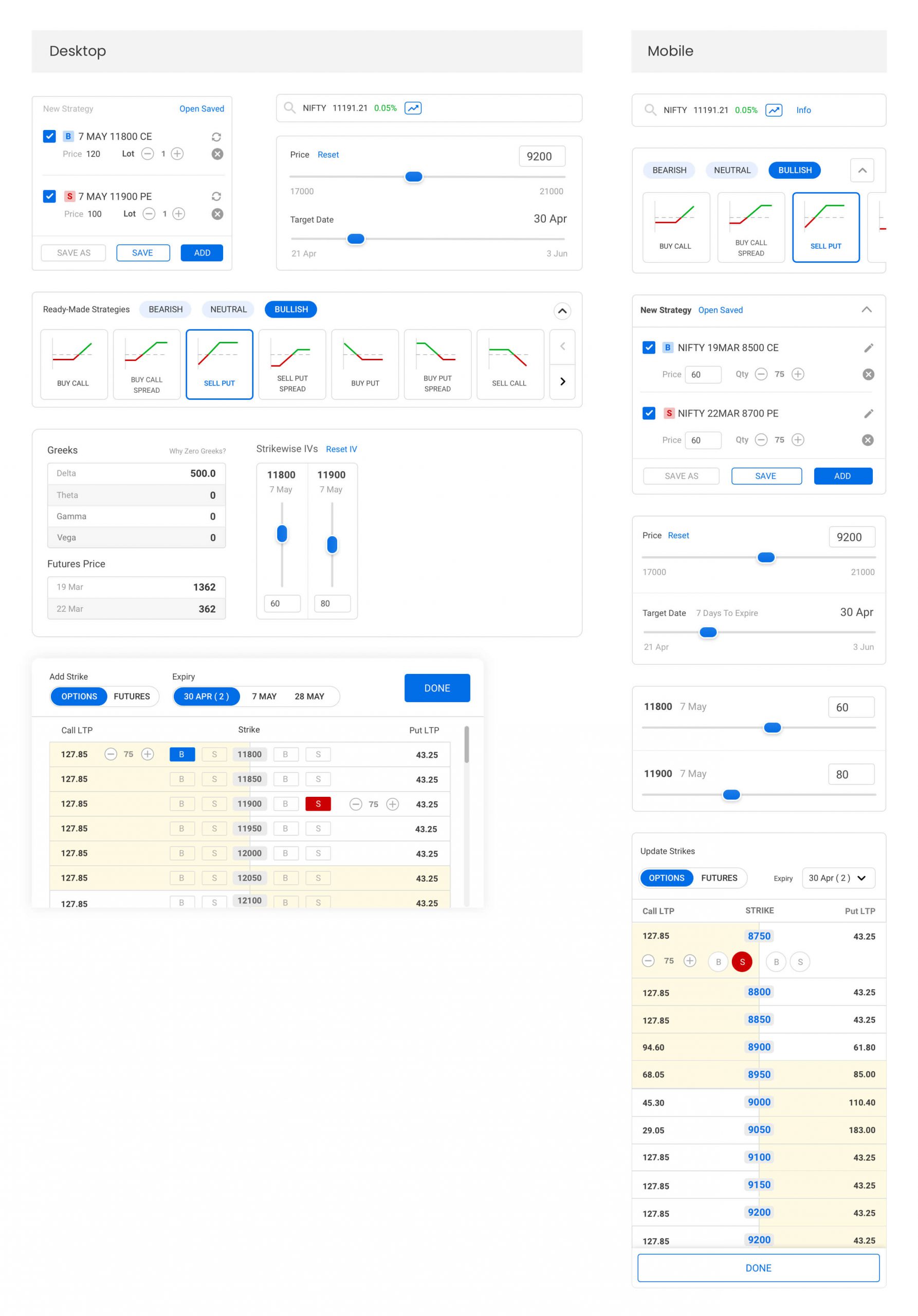
Final Version

Lets understand the experience
Easy and intuitive add / edit legs
User can click on add/edit to manage all legs they have added in a single glance from the drawe comes up from bottom.

When users in the process of something and if you take them to a completely different page or visual that clearly break user’s process and user just end up with frustrations with the experience.
That’s why I thought to have something that comes up in between and goes when get done with it without a break the flow for a user. And Drawer was the perfect design pattern that fits in the need.
Legs addition only needs single click to add a leg for buy/sell of call or put of any strike. This helps traders to get done things quickly and review at the same time.
Ready-made strategies
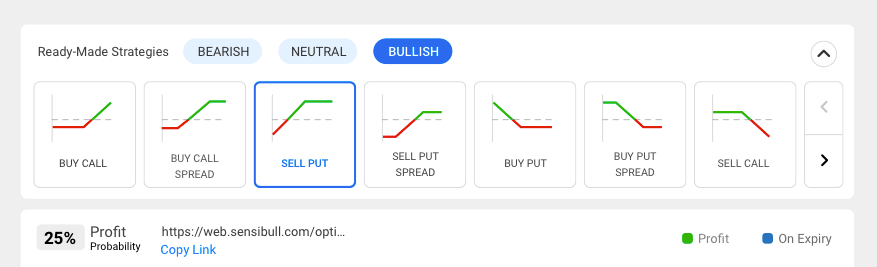
There are three different categories for ready-made strategy, which is bullish, bearish and neutral so user should also know about which direction they want that strategy about. Based on the selection system will generate one.
Collapse interaction helps once user selected a required ready-made strategy. After that there is no need to take that prominence on the screen.
Grouped layout
All the sections are needed at different stages of the whole process. Hence grouped layout helps users to focus well. And all different sections are grouped by similar information and interaction.
Overview in single glance
The whole layout and spacing are placed that way that even if user is using s 1200 X 650 screen they would be able to do all things all together without any compromise of use.
Initially there was lot negative spacing was taking a lot space and because of that user is end up scrolling a lot time meaninglessly to view graph and interact with slider and again goes to add/edit strategy.
This is a much better experience for a trader even on a smallest screen to interact with almost everything that requires.
Hi-Fidelity user test
Since we were keeping user at the centre through out the process, the high-fidelity prototype is basically the outcome of all the discussions we had with users till now. Users mostly like the attractive User Interface.
Apart from the test, users are more interested to use the functional one where all data processing and actual numbers take place. But that requires a bit of time for tech to get done with design and push to production. I was happy with the final design and was curious also to know about real feedback after this release.
In a startup like Sensibull, push to production quickly, get feedback fast, and then iterate again is the only key to get success. And let me tell you again, that’s the only way to success 😀 .
Time to test the assumption
Cheers were many but here are some tears 😛
- Legs add / edit is really nice but occupying half graph screen
- I need to scroll to the whole summary
- I just want to change 1 strike in 1 leg. For that I why you are opening the drawer
- There are few other ready-made strategies that are separated from bullish, bearish dn neutral. Which was not in the list.
- As same as a strike is in textbox if I will have a next previous control for date also that will be better
“Iteration is a never ending game”
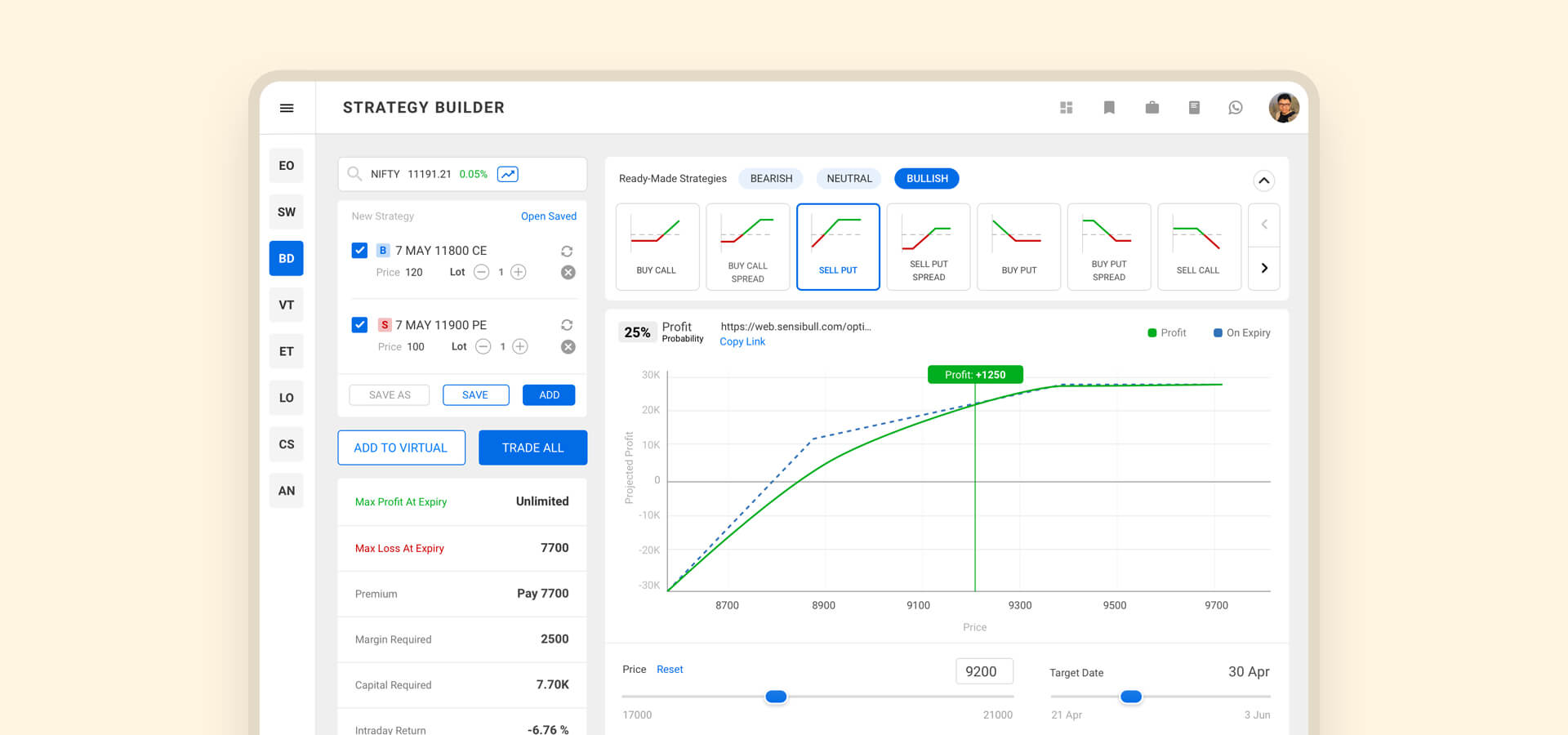
We keep iterating the builder and below is the current version. After doing user interview and support sync we were able to understand user’s need and try to delivery the expectations.

Project takeaways
I had learned many things in this project. Here they are,
- Users are happy to interact with a unusual experience if that does the job
- Don’t let user scroll if the experience can be fit into a single glance
- Take advantage of system oriented tech automation
- Keeping user at the center throughout the process helps in reducing repeat work
- The end goal has to be clear throughout the process
- Do not break habituated behavior