POS, A transaction story
Designing transaction module for a POS device which will be used for small merchants and retail stores at purchase counters.
July 2019 project
Freelance
2 Months
White Board, Adobe XD, Adobe Photoshop
Design Process
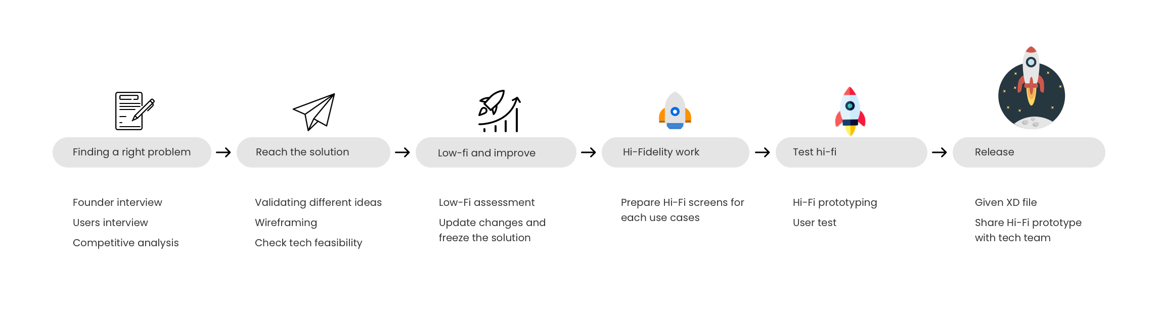
Founder's Interview
A founder mostly wants something in some way. But the designer’s job to understand reality and take the best-fit decision for the user and business. Hence user interviews and competitive analysis helps to reach to statistics which defines good or bad ideas in the process. Below are some insights came from doing the excersize,
- A transcation module should not be limited to a particular industry as in case of scaling a product that will be a difficulty comes on way.
- Navigation is the biggest worry for the particular transaction
- User should not need as minimum guidence to adopt the experience and get used to it.
- We can not make a fancy animations and difficult interaction at the time of launching a product. So try to come up with solution that take least amount of development.
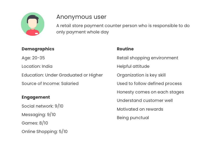
Users and pain points
Who is our user?
Targeted users are mostly young and coming from very similar family backgrounds and within the same family earnings range. Below is a user persona that defines a type of user overall.
Interacting with real users
Qualitative feedback is more useful than a quantitative one to me in most cases. In interviews like this, you really get a chance to interact with a real person (who is using a product) and drive a questionnaire the way you want. I connected with 2 users differently. Both users are doing the same task but for a different type of merchant.
1. Anonymous user who works in a retail store
As a user of small retail store, a biggest problem for him is to find a right item quickly as possible. In a current system he’s not able to reach to a appropriate item just because of complex interaction of a device. Sometime, he is end up generating a wrong bill.
In a current system he’s using always needs to add a customer first even if there is just one item bill and not required to add that transaction for the customer.
2. Anonymous user who works at a cafe
As a user he is always struggling with quick item addition to a bill. Where fixed numbers of items they have and usually repeated by most customers.
Selection process is a bit long compare to what they were using.
Behaviour analysis
Unconscious actions have a direct connection to the mindset of a user. Without jump right into a project, I gave some time to understand a user clearly. This project is the product’s transaction module only.
So how users think, how they behave in such moments, and most importantly how they act on such conditions are very important to understand before going deep towards a problem.
Address user pain and competitive analysis
During purchase, it is a lot more pain if a product is not being added quickly into the list of purchases for a customer.
Information has to be relevant. Sometimes for a user is it way more difficult to reach out to a correct detail they actually want to look at. Competitive analysis helps to assume the basic interaction methods the user expected.
Insights from user interviews
- Users can not wait for transaction gets done faster
- Search should not be difficult to reach to required item
- Rewarding a customer is difficult
- For fixed menu items it is irritating to follow all steps again and again. Same problem with increasing quantity for selected items. Interaction takes a lot of time just for small task to get done.
Competitive Analysis
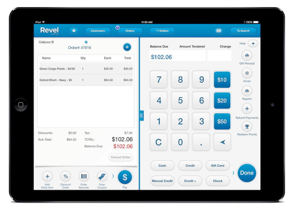
Pros,
Standardised UI language
With wider area of action, quick items addition is easy
Readability is clear
Predictable UI
Cons,
Quantity counter is difficult
Only total billing is emphasised
Too many buttons on glance
Not sure inventory items selection is covered or not

Pros,
Good layout for divide attention
Placement of CTAs and billing items makes sense to be at the right side
Easy recognition of items by images
Cons,
Important information not getting desire space on visual
Inventory section takes all attention. Searching is bad and easily able to miss.
Iconography is not standardised
Readability is issue with all text are in equal importance
Change of quantity is difficult
Pros,
Clear CTAs and less mental burden
Buttons for inventory are good for quick selection
Customer information, items details recognizable
Good use of space
Predictable UI
Cons,
Typography can be improved
Tabs should not be at the bottom as it’s easy to miss in the whole experience
Icons selection is bad

Pros,
Clear dividation of selection and billing
Less mental burden to consume
Clear CTAs
Cons,
Too wide buttons
Typography is not standardised
Area of action in billing section is bad
Not sure about search is a feature or not since it is placed at very top with next to no importance
Wireframing for layout
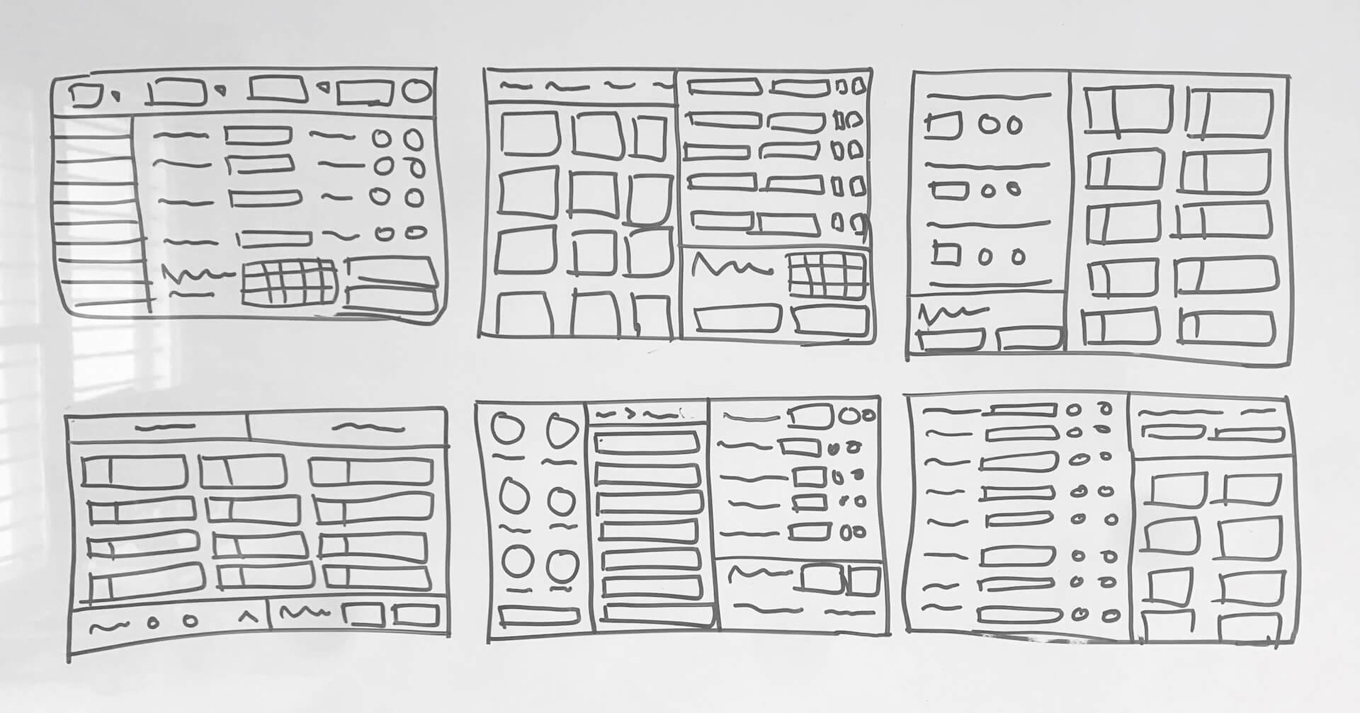
Why finalized below layout?
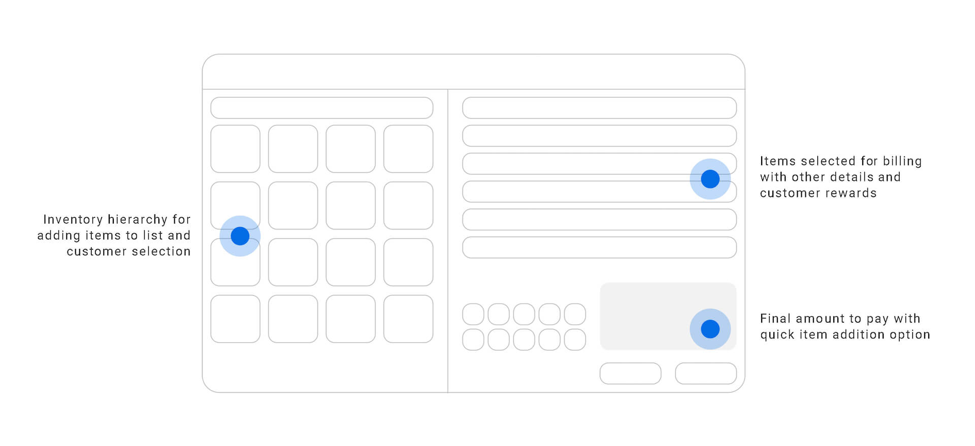
As per common behavior of payment counter person that they hold a device in the right hand for all CTAs. Whatever they were searching for they usually prefer to check on the left and review the overall selection on the right side
This layout breaks the whole thing into two separate sections which is selection section on left and review section on right. Hence it is a bit easy for a person to focus on one section while doing one action.
The right section is further broken into top and bottom sections. Where a top thing is all about items that customers purchasing and the bottom is the final amount to e paid with total discounts. Which seems convenient for a user to differentiate easily.
Feasibility check ( Tech coordination )
In the initial stage of a product, a small development team was working on a project. By keeping in mind about not everything will be possible to be developed I need to think that way and approach a problem.
UI components
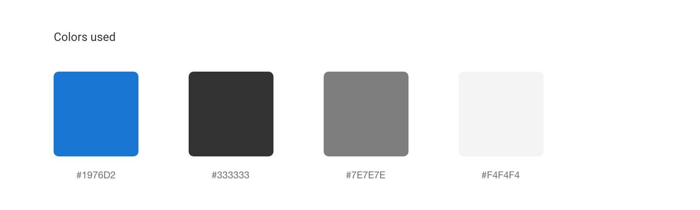
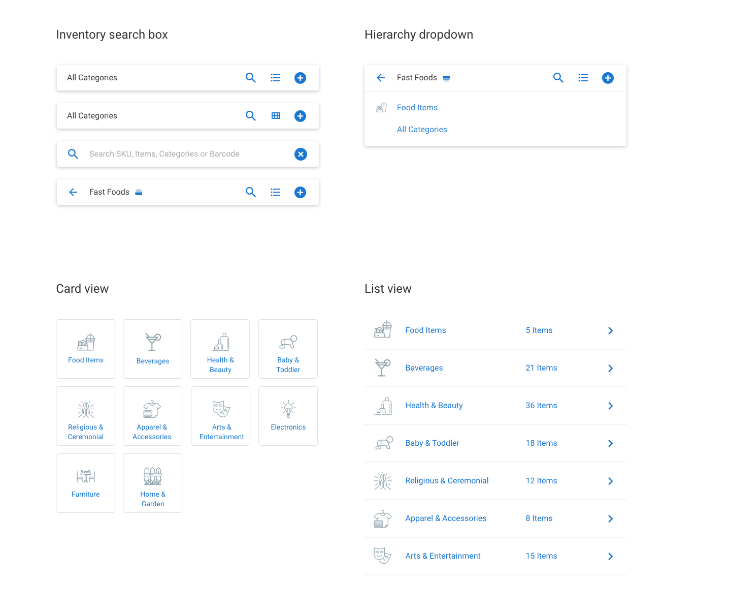

Thoughts behind UI lannguage
This UI language has as minimum as colors rather than create beauty with numbers of colors and make it toxic. I thought of less is more is the best thing to do with this interface. All component has simple interactions that can be understood.
Breadcrumbs are really a bad choice to have for category selection. In an interaction with a user, I realized they never take a lot of attention to the visual and just want a single action that makes their life easy. Hence to go back I had chosen to add a simple back button and not really big breadcrumbs to increase reading just to perform going back action.
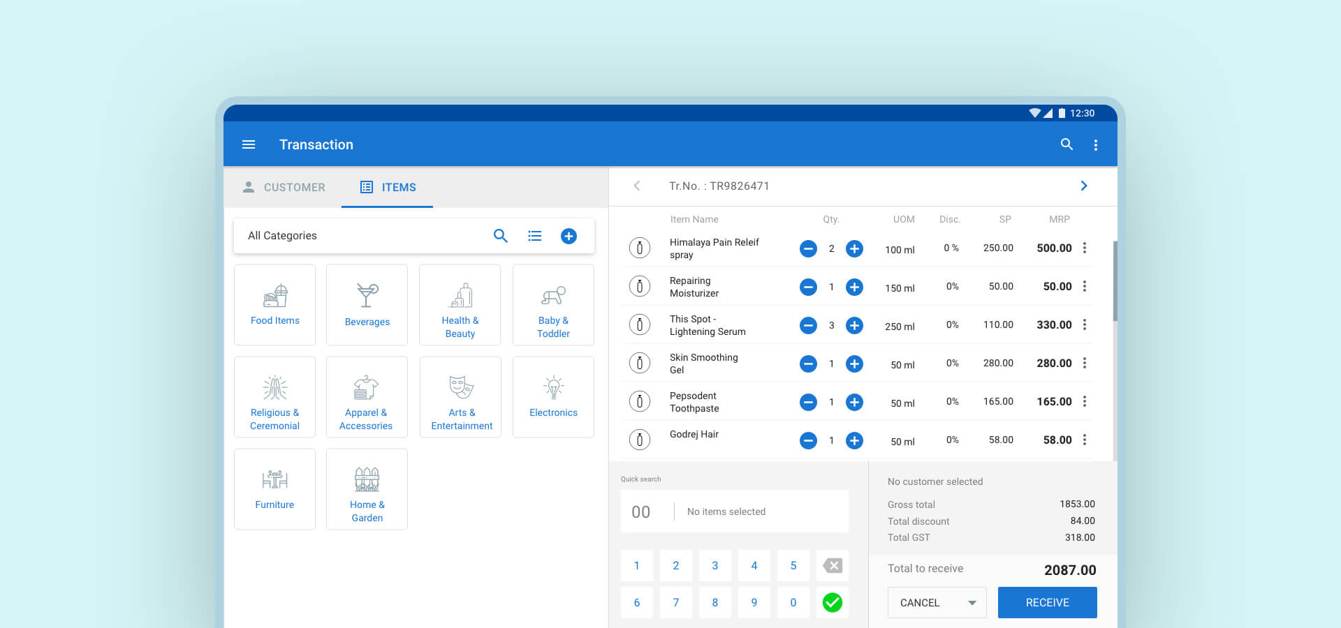
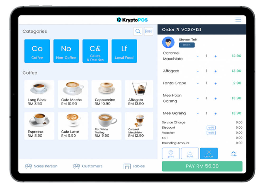
Final version

Let's understand overall experience
Less is more
The minimal mental burden always turns out fast action. In this approach, I reduced the mental burden as little as possible. Colors are used wisely and the way that user focus on actionable things on visual very clearly without giving a shot in mind about will something I’m doing will work or not.
Primary and secondary information has to be valued the way it is. Users can not focus on everything you present to them. Hence a visual should speak the required language and reduce cognitive load.
Intuitive interactions
Predictability is another part of a first-time experience but that doesn’t mean a first-time intro should be the approach for all one-time discovery problems.
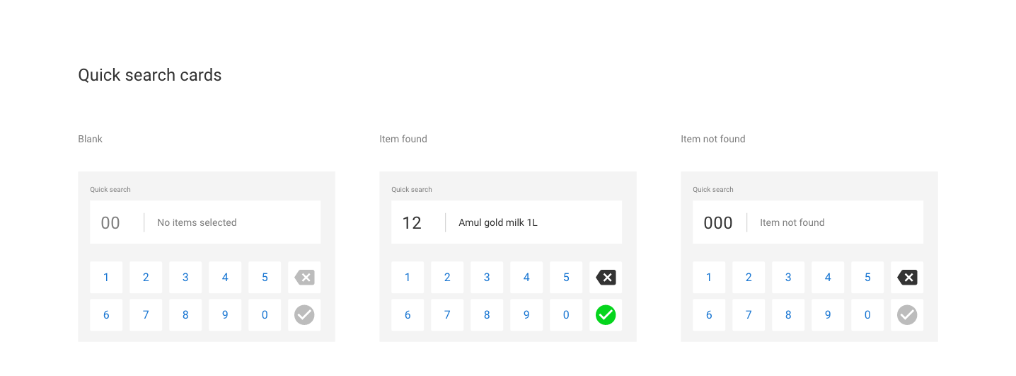
Interaction has to be aligned with real-time world examples by what users don’t need to put an extra load to understand things whether they are first or second time user on the same device. The quick search interaction is placed at the bottom where the user can add quick items from the bottom and see things at the top while doing hierarchy stuff on the left from the whole inventory section.
Two different journeys
Users don’t like if interactions are getting mix in two different type of journey. They just feel complex that way. So better we separate two different journeys clearly. On one hand, they are able to select items and customers for a particular billing process. And on the other hand, they check the final stuff.
On a smaller device like a tablet, it is more important that we provide flexibility in separate are for different things.
Time to test assumption
Time to test the final prototype with people whom I had interviewed for pain points. Here are cheers and terms from them,
They found it fresh looking view
By reducing the mental burden and the cognitive load they liked the visual in the first place. It often works when you see something clear and fresh-looking product rather than one multi-colored and complex thing.
It turns out well if you just focus on when user wants to see and what you allow them to see on visual, I think that makes the whole difference.
I often try to cover 2-3 levels of “WHY” when the need to choose something has both strong sides and need to choose one. It is not like which one is bad, it is just which one server better for the majority of your audience. After all, you need happy customers :p
Easy to understand what to find where
Primary and secondary things are differentiated here wisely so the user catches what requires attention for what reasons. Intuitiveness is key specifically where time is a barrier.
Quick search is intuitive enuogh but need to interact for get used to it
I found user got the idea behind what is this about. But then we are not sure that will work the same way they are thinking. They actually asked me that am I right? I said yes that’s how you need to add quick items.
Suggestion
They suggested if you show reward points owned by customer in the selection process will be good put.
I missed this point when thinking about creating a customer selection list. I better preferred putting a phone number next to a name. But that person said as a routine customer we want to check redemption points they have rather than a phone number.
Here in this case phone number has it own benefit of verification but this is a real user feedback who is going to use a product so hands down 🙂
Project Takeaways
- Time is a big constraint for some particular experience you are delivering.
- Understanding behaviour solve many things even before you go deep.
- Like product’s navigation, the common solution can not be the best fit for all the problems.
- Less mental burden helps in better engagement