
Multi-Supplier Checkout Story
Enable users to add products from multiple suppliers for a single order.
August 2021
Employer
2.5 Months
Figma, LookBack, After Effect, Analytics Tool
Design Process

Overview
Meesho is an Indian reselling platform with a niche making online reselling and shopping hassle-free and affordable. It provides secure and timely transactions, as well as low-cost returns and shipping. Meesho is trusted by more than 4 million entrepreneurs throughout India.
To give a better idea of who the entrepreneurs and consumers are,
Meesho powered entrepreneurs are someone who can easily launch their very own online business without investing a lot of money. They earn money with Meesho by reselling the products and setting a gross margin to every transaction.
Consumers are customers who purchase products for their own use and do not indulge in any reselling.
In the initial stages Meesho’s main concentration was on suppliers and the users could only order from a single supplier at a time. When it comes to shopping we want to give users a seamless experience based on the idea of transparency. With this as a priority we are trying to enable users to order from multiple suppliers in a quick single checkout experience.
Personas
Below are the two personas that are covering most of our user base and with insights necessary


Old Flow


Contextual Inquiry Insights

User Pain point
Some of the major pain points form both the customers and entrepreneurs viewpoint that were discovered with previous designs are addressed below for better understanding
Consumers
- Retaining quick checkout behaviour from B2C checkout - Users would want to quickly buy a product despite the multi supplier checkout option. And the conversion rate of this in B2C checkout is 30% high compared to the Cart icon on the header.
- Comprehension of multi supplier cart - Even though the IA is more or less the same, there are a few optimisations done for consumers so they can comprehend the shipping charges if unbundled from product price. Also providing a way to deprioritise certain products on cart.
- Navigating partial cart serviceability - Guiding users with appropriate information to help them move forward in such a case that is crucial.
- Easy discovery for both supplier and cart level offers - With good grouping, consumers should be able to redeem offers and understand additional charges if any gets applied.
Entrepreneurs
- Comprehension of margin addition at multiple product checkout - Margin addition and distribution across products logic should be conveyed to the user. This change should not be too complex to understand.
- Entrepreneurs should be able to share from anywhere at PDP level - They skim through certain information like real images and reviews to make the sharing decision which we would want to continue showing.
Competitive Analysis
With the insights from the personas we wanted to conduct further competitive analysis. A Detailed study all two popular e-commerce platforms Flipkart and Amazon. To bring in key insight for the proposed solution with the analysis, all these platforms have a check out experience that provides users to add products to cart or check out directly with the buy now feature.

Learnings
- Users would want to quickly buy a product despite multi supplier checkout option
- Emphasis of CTA for better order conversion
- Entrepreneurs rely on product images, ratings and reviews before sharing a product. Hence it becomes imperative to have it accessible across the screen
- Supplier level grouping for better representation of offers and promotions
- Cart and Wishlist as parallel concepts
- Price info chunking for easier comprehension
User Flow
Add to Cart
As per the user multiple potential solutions were explored and compared on each step of the user journey to build the best experience for meesho’s customers. Let’s dive deep into it and see the design thoughts driving these decisions.

Buy Now
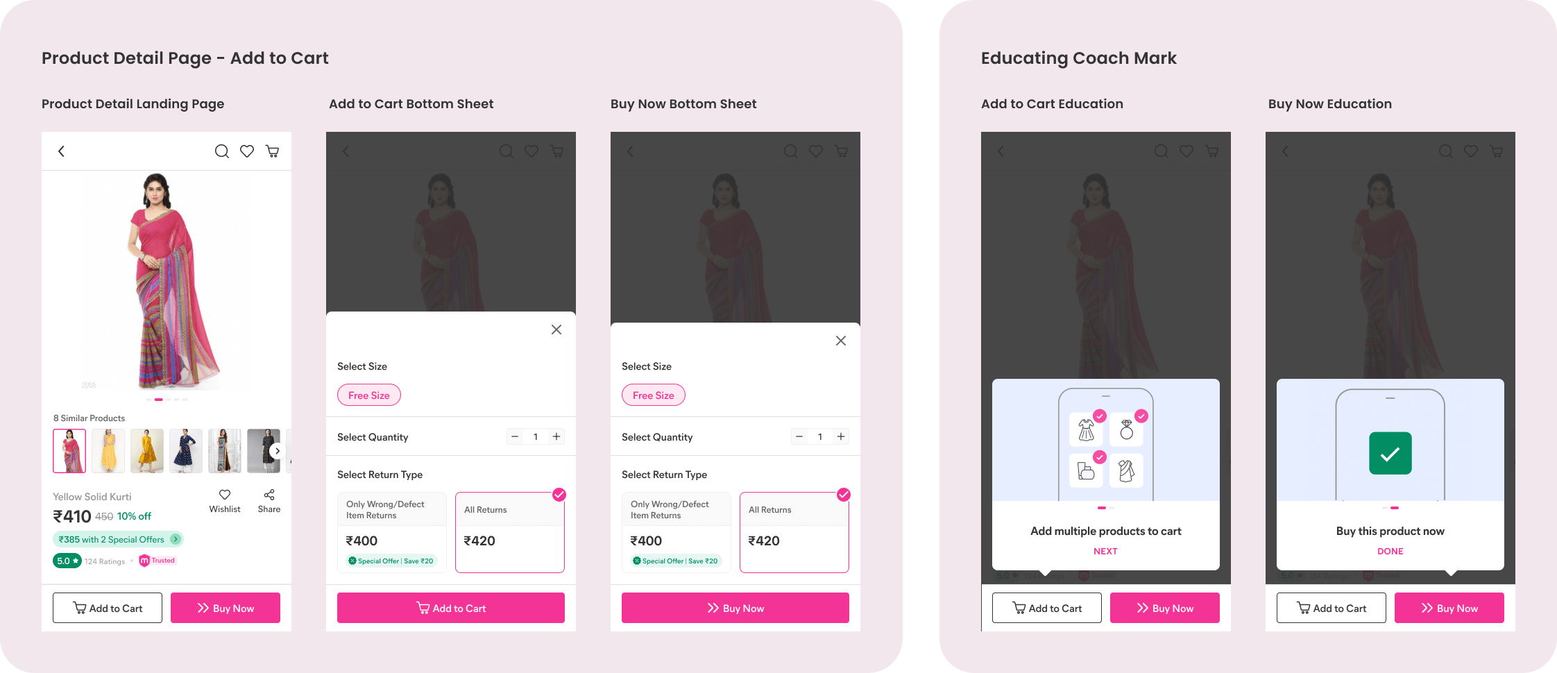
Introducing ‘Buy Now’ to retain B2C checkout behaviour –
Users would want to quickly buy a product despite the multi supplier checkout option. And the conversion rate of this in B2C checkout is 30% higher compared to the Cart icon on the header.
Why Buy Now? – Although it was called ‘Add to Cart’ in the B2C checkout, the right connotation to single product purchase, immediate buy, quick buy can only come from ‘Buy Now’

Touch Points
- Product Detail Page – PDP
- Cart View
- Address
- Payment Options with Margin
Solution Discovery
Product Detail Page
- Introducing ‘Buy Now’ to retain B2C checkout behaviour so that Users can quickly buy a product.
- Emphasis of CTA for better order conversion where they are regrouped based on actions that are taking before making a choice to order
(Wishlist – Consumer, Share – Entrepreneur)
& actions taken to place an order (Add to Cart, Buy Now) - Show ‘share’ upfront for entrepreneurs as they rely on product images, ratings and reviews before sharing a product. Hence it becomes imperative to have it accessible across the screen


Cart
- Supplier level grouping – The cart has products clubbed at supplier level for the following reasons Offers & Promotions at a seller level (offers, delivery comms)
- Cart and Wishlist as parallel concepts – Cart is also used as a wishlist now as both support delayed decision on order.
Even after adding products to cart, users can specifically move some products to wishlist or pull from wishlist onto cart - Price info chunking for easier comprehension – With the offers and unbundling features, there can be too many line items in ‘Price details’. Chunking them into positive (discounts) and negative (additional charges) to reduce cognitive load.

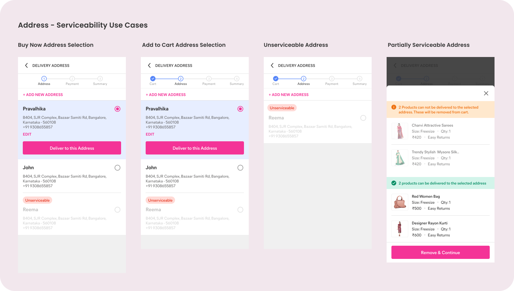
Address
- Delivery date on address – Delivery date on address can’t be estimated for Multiple products. It could be misinforming the users
- Partial cart serviceability – Users will have take a call –
Either move forward without the product (likely a consumer)
Choose different address (likely a consumer) - Go back to PDP find a similar product and checkout (Entrepreneur likely to do this)

Payment Options with margin
- Keeping it simple to comprehend – Single action to add margin and less control at product level to avoid complexities and error cases around MRP. Order level margin can be an evolved behaviour of entrepreneurs.
- Visibility of margin distribution – Margin distribution across products can be done with a formula (price and quantity proportional) and providing enough visibility around it can reduce any CX queries around it.

Final Screens & Rationale
Product Detail Page
A product detail page allows users to add product to their cart and also place order seemlessly from Buy Now. We have also enabled education when only old user lands on the app after updating an app.
Cart
After couple of iterations we had finalised a wishlist as a feature which empowers user to quickly store their products which they might want to add to cart later.
Also we had brought Remove a product optin outside which enables access of wishlist feature in the right direction. So if user is not interested to have product in the cart then they can remove from the cart and quickly add into wishlist list from there they can access later.

Address
Not all addresses are serviceable for all suppliers. So here we have covered all cases where users can see appropriate use case when they select an address that is, Fully serviceable, partially serviceable, and unserviceable.
Payment
In terms of payment you can not move ahead with even a small ambiguity. Hence after exploring many iterations and complexity of the margin feature we thought to make it more simple as possible and allowing users to only check and add margin for the total of the order they want to place.

Usability Testing Insights

Feature Walkthrough on Production

Project takeaways
I learned many things in this project. Here they are,
- Simplicity wins in any case if that serves the same purpose
- Data gives you the power to take some hard calls
- Leverage graphical power to communicate complex educational steps
- You have to be very clear when it comes to Payment
- All edge cases are important to solve